freddie’s organics
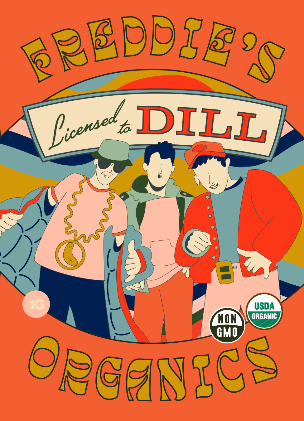
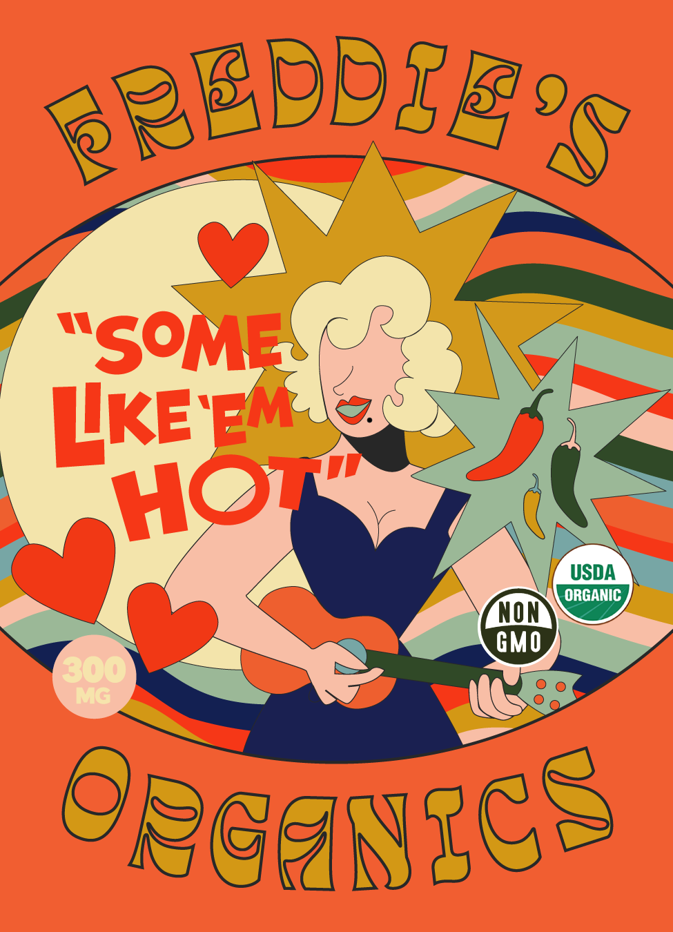
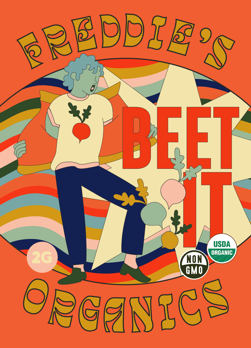
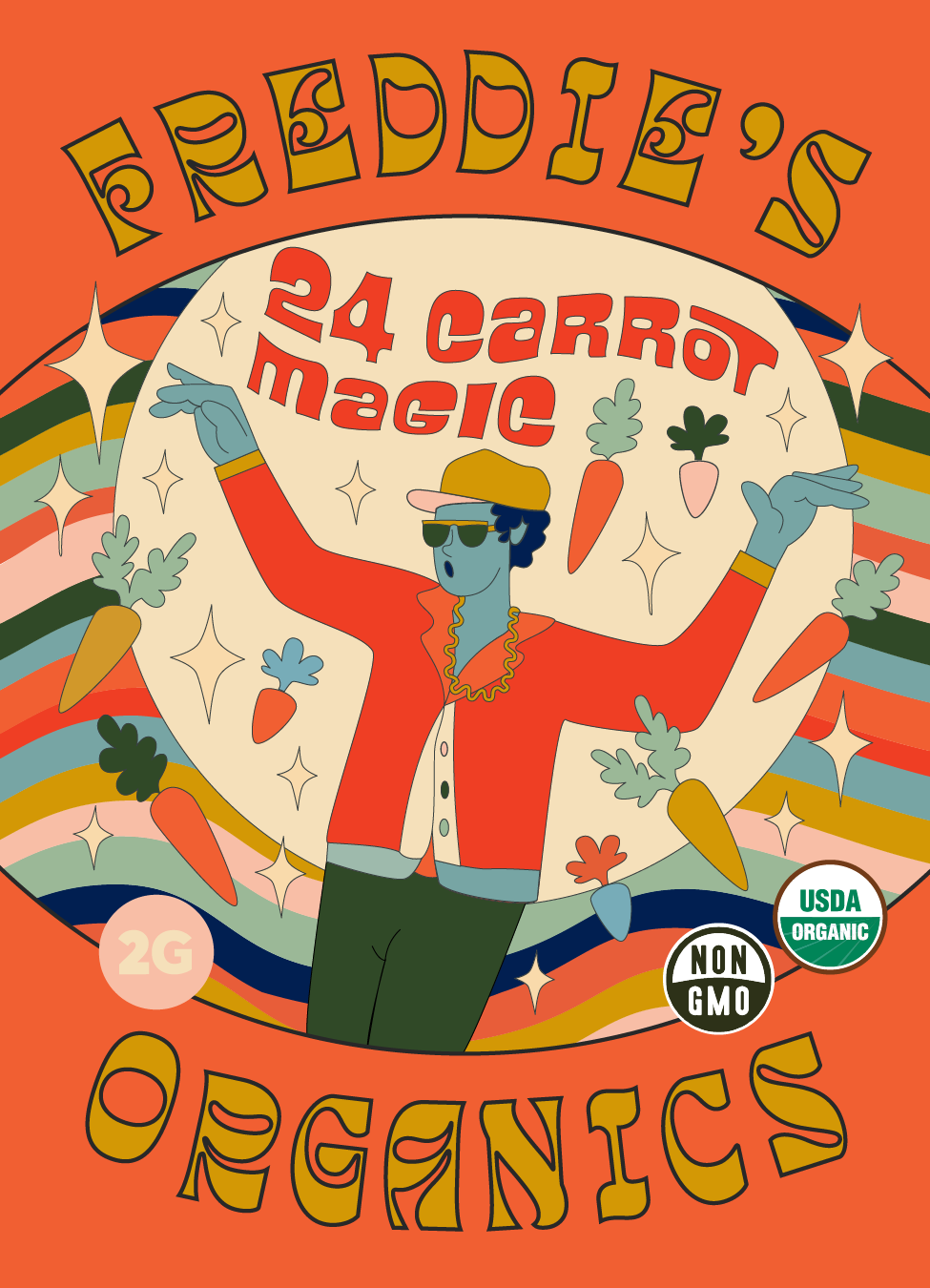
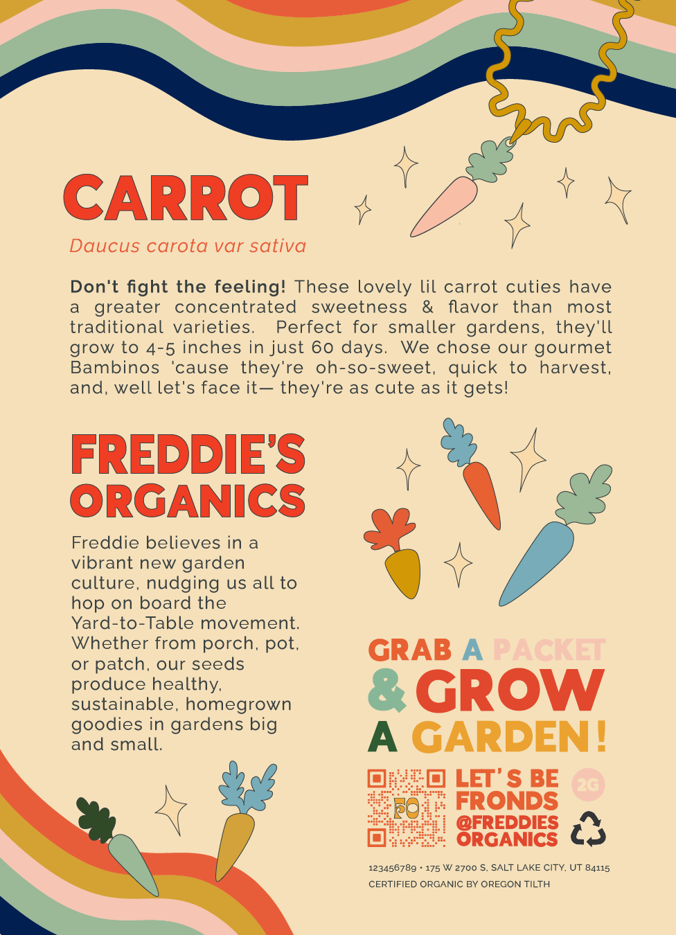
Led the creative direction and brand strategy for Freddie’s Organics, taking gardening from an outdated pastime to a modern, fun activity for Millennials. Developed a pop-culture-centric brand identity, combining innovative packaging design with culturally resonant storytelling to make the brand relatable and engaging.
-
Transform gardening into a fun, modern activity that resonates with Millennials, by creating a brand and packaging that feels fresh and culturally relevant.
-
The founder presented a wide range of names, from clever puns to pop-culture references. Our challenge was to unify these under a cohesive brand identity that would resonate with Millennials and make gardening feel fun and accessible. The initial list included everything from “Takin’ a Leek” (for leeks) to “Pick a Chard, Any Chard” (for chard) and “Back That Peach Up” (for peaches, though ultimately not chosen due to their unsuitability for backyard gardening).
By categorizing the names and exploring themes like nostalgia, humor, and pop culture, we identified that a pop-culture-centric approach would strongly connect with our target audience. This insight led to the decision to build the brand around cultural references, making gardening relatable and engaging for a new generation.
-
Increased Interest in Home-Based Hobbies: Post-pandemic, Millennials are spending more time at home and engaging in hobbies like gardening. Existing gardening brands felt outdated or niche, failing to reflect Millennials’ youthful, modern attitudes.
Renter-Friendly, Adaptable Gardens: Many Millennials live in rental properties, so seed varieties needed to be suitable for small, non-permanent spaces like pots or small garden patches.
Trend Toward Nostalgic Pop-Culture: There’s a strong social trend toward nostalgic pop-culture references as a form of escape and comfort. Millennials are seeking brands that can revive their spirits with small, meaningful ways to brighten their days.
-
Our exploration revealed that music and movie references offered strong potential for a relatable and innovative brand narrative, with accompanying album art and movie scenes providing instant creative fodder for packaging illustrations. Recognizing that many Millennials are renters, we focused on seed varieties suitable for small spaces. The chosen names tapped into pop culture, allowing for visually compelling and culturally resonant storytelling—a fresh approach in the conservative gardening market.
The design process broke away from industry norms by opting for modern, geometric illustrations over traditional photo-realism. This strategic choice made Freddie’s Organics instantly recognizable. The use of bright, contrasting colors further distinguished the brand from typical earth-toned packaging, redefining what a gardening brand could be: fun, accessible, and culturally relevant.
-
The vibrant packaging and punny references secured placements in boutique stores catering to consumers prioritizing aesthetics, sustainability, and organic products. This strategic innovation helped drive significant interest, resulting in a 25% increase in sales within the first quarter post-launch. The packaging not only stood out on shelves but generated brand love among retailers and customers alike, significantly boosting brand recognition and engaging a new generation of gardeners.
